
In today’s fast moving digital world, your website is most commonly the first impression to potential customers. That means it needs to load quickly, look great, and perform properly on every device – from a desktop to a mobile device. This is where responsive design comes into play. Beyond just aesthetics and usability, did you know that responsive web design is also a major factor in how your websites rank in search engines?
With over 5 billion global internet users – and the majority of browsing being done on mobile – ignoring responsive design means alienating over half of the audience. Google’s algorithms now prioritise websites that deliver seamless experience across devices, making responsiveness a non-negotiable for visibility.
Search engine optimisation is no longer just about keywords and backlinks- user experience and accessibility are now just as important. A responsive site not only helps you reach more users but also tells google that your website is trustworthy and worth a high ranking.

Why Responsive Web Design Matters for SEO
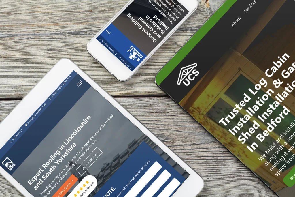
Responsive design means your website can adjust to fit any screen size – varying from desktop monitors to mobile phones and devices. It isn’t solely a cosmetic feature; it directly impacts your search rankings.
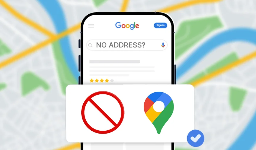
Google now uses mobile-first indexing, meaning that the mobile version of your site is primarily evaluated to determine your ranking. If your website isn’t mobile friendly, it may struggle to appear in search results – considering over 62.22% of global web traffic comes from mobile devices. This staggering number makes mobile optimisation a business imperative- not just an SEO tactic. This means that if you did not have a mobile optimised website, you are not only lowering your search rankings, over half the users will only see your poor version of the website.

Mobile-first indexing isn’t just a trend – it’s the default. Googlebot crawls and indexes the mobile version of your site first. If your mobile experience is broken, slow, or unreadable, your rankings will suffer, even if your desktop site is flawless.
Main Benefits of Responsive Web Design for SEO
Better User Experience:
A seamless user experience across devices keeps visitors engaged. When a user can easily navigate your site on mobile or desktop, they are much more likely to stay longer, lowering bounce rate and improving SEO performance.
For example, a responsive site automatically adjusts button sizes, font readability, and image dimensions for touchscreens. This eliminates frustrating pinch-to-zoom actions or misclicks for our mobile users. This is a massive reason why users, potential customers, abandon non-responsive sites.
Faster Loading Times:
More responsive sites load faster as they eliminate any unnecessary redirects and are built with performance in mind. Faster sites boost user satisfaction and improve SEO rankings.
Did you know that a 1 second delay in load time can reduce conversions by 7%. Responsive design avoids redirects to separate mobile URLs.
Less Duplicate Content:
Using a single URL for all devices means you avoid creating multiple versions of the same page. This also reduces risk of penalties & content duplication and ensures a consistent SEO ranking.
Duplicate content confuses the search engine and dilutes your ranking power. If all backlinks and traffic point to one URL, this consolidates all your SEO into your page and boosts SEO ranking.
Better Crawling and Indexing:
Responsive websites have a unified codebase, which simplifies your web page. Googlebot can crawl and index your page more efficiently, helping your page get found easier.
A single codebase means Google’s crawlers don’t waste budget on redundant pages. This is especially important for your larger sites, where crawl efficiency directly impacts content indexing.

How to Implement Responsive Design for Better SEO
Most platforms have tools included for optimising for different device sizes and if you are working with a professional web designer then having a website optimised for all devices is the standard. Make sure to preview your site on various devices and screen sizes. Regularly test using tools like Google’s Mobile-Friendly Test to ensure compatibility.
Pro Tip: Use CSS media queries to define breakpoints for different screen sizes. Test this on real devices (not just on emulators) to catch issues like responsiveness and rendering that other tools and emulators might miss.
Conclusion
Responsive web design is not just about aesthetics- it’s a crucial part of SEO and web design. A non-responsive site risks being invisible to google and inaccessible to your customers.
The evidence is clear: responsive design future-proofs your site, aligns with googles optimisation priorities, and maximises customer satisfaction. Whether you’re rebuilding or refining your website, responsiveness should be at the top of your SEO checklist. No customer wants to make purchases on a site that doesn’t respond and look professional.
Can you now imagine your website not being optimised for mobile and running the risk of Google never showing it to your customers?


