
What is Typography? Typography is more than picking fonts—it’s the art of arranging text to make your website appear aesthetically pleasing, readable, and effective at communicating your message. On the web, typography plays a crucial role in user experience (UX), branding, and even search engine optimization.
With 62.22% of the world’s internet traffic originating from mobile (as of March 2025), responsive typography is no longer a choice. Google’s mobile-first indexing favours mobile-friendly websites, so your typography needs to adjust effortlessly to every screen size to preserve rankings and retain users.

Why Typography Is Important for Your Website
User Experience (UX) Matters:
Poor typography makes websites hard to read, making users annoyed and resulting in high bounce rates. Proper typography makes users more engaged, keeps them on your site longer, and guides them naturally through your content.
Brand Identity:
Your typography conveys your brand personality. A law firm might use a classic serif font (e.g., Times New Roman) to look professional, while a tech startup might use a modern sans-serif (e.g., Inter) to give a fresh, approachable impression.
Mobile & Responsive Design:
Typography must be legible across all devices. A font that looks great on desktop may become a mess on mobile if not properly optimized. Responsive typography adjusts size, spacing, and composition to render it readable on screens.
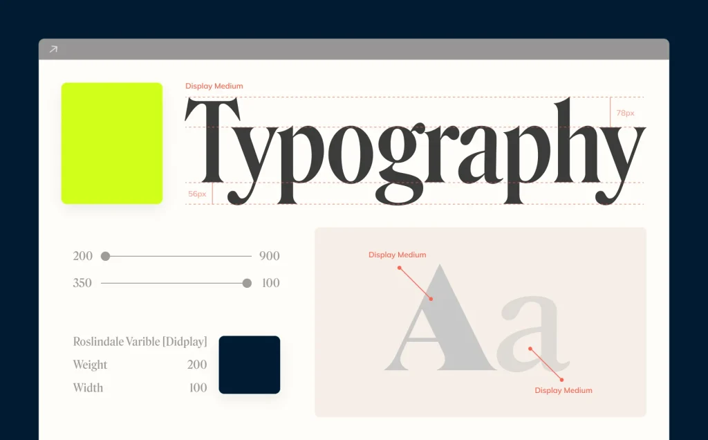
Key Typography Elements Every Business Owner Should Know
In this section I will show you the fundamental rules for typography- with these set fonts, sizing and spacing depending on the web page.
Font Selection:
Pick one font for headings (like a bold sans-serif for modern brands or classic serif for traditional ones) and one clean, readable font for body text. Stick to web-safe options (Google Fonts has great free pairs) and avoid fancy display fonts—they’re hard to read in paragraphs. Test your choices on mobile first, because if it’s not legible, it’s hurting your business.
Font Size:
Desktop: Body text size should be at least 16px. Mobile: Increase to 18px+ for readability. These sizes are the tried and tested ideal sizes for different devices.
Line Spacing & Letter Spacing:
Line height (leading): 1.5x the font size (e.g., 16px font → 24px line height). Letter spacing (tracking): Reduce the space between letters a bit for uppercase or small text.
Contrast:
High contrast between background and text is a requirement (e.g., dark text on light backgrounds). Low contrast (e.g., gray on white) strains readers’ eyes.
Hierarchy:
Typography hierarchy is like signposts on a highway—it tells visitors where to look first and guides them through your content without them getting lost. Here’s how to do it right: Headings (H1-H6): These are your billboards.
H1 (Main Title): Big, bold, and impossible to miss (32-40px). This is your page’s headline—make it count.
H2-H3 (Subheadings): Break up sections (24-28px). Think of them as chapter titles in a book. Body Text: The meat of your content (16-18px). Keep it clean and readable. Why it works: Our eyes naturally follow size differences. Big text grabs attention first, while smaller text keeps readers moving smoothly down the page.
Font Pairing:
Pairing fonts is like choosing an outfit—you want pieces that complement each other without clashing.
Here’s a simple formula:
Pick One “Personality” Font (for headings): Bold, stylish, and expressive (e.g., Playfair Display, Montserrat Bold). This is your star player—it sets the tone.
Pick One “Team Player” Font (for body text): Clean, neutral, and ultra-readable (e.g., Roboto, Open Sans). This does the heavy lifting without stealing the show.
Pro Tip: If you’re unsure, Google Fonts suggests pre-matched pairs (like Poppins + Lora). Stick to two fonts max—any more looks messy.
The Psychological Effects of Typography
Tone & Mood:
Depending on the style and bold fonts. You can set the mood for your website. Here is the general rule of thumb for Tone and Mood:
Bold fonts convey confidence. Rounded fonts feel friendly. Script fonts add elegance- but you should use these sparingly.
Trust & Professionalism:
Certain fonts convey more trust and professionalism than others. For example, modern sans-serif fonts can feel more open and welcoming, while serif fonts may seem more reliable and professional.
Just think about it- if you saw a font like this: “Come buy stuff now!”. Would you trust it?
Engagement:
Well-chosen fonts draw attention to our CTAs. Such as bold buttons with clear typography. E.g. A “Sign Up” button in a bold, contrasting font converts better than a faded one.
Typography Best Practices for Your Business Website
Keep it Simple: Only use 1-2 fonts maximum to avoid any clutter.
Focus on Readability: Ensure the font is legible on all devices. For small businesses, readability should always come before flair. Prioritise legibility over flair.
Use Google Fonts: Free, web-optimised fonts like Roboto and Poppins load fast.
Test Typography: Try to test different fonts and styles to see what works best for your audience and website.
Consistency is Key: Typography should be consistent across all pages to maintain a cohesive design.
Common Typography Mistakes to Avoid
Too Many Fonts: Having too many fonts can confuse users and looks unprofessional. Resulting in a lowered page ranking.
Small Text: If your text is too small- mobile users may not be able to read it. This would mean neglecting over 50% of your consumer base! Test this on real devices.
Low Contrast: This makes your site inaccessible. Ensure you follow guidelines such as the WCAG.

Conclusion
Typography can make or break your website. The right font choices improve readability, reinforce your brand, and keep users engaged—while poor typography drives them away. By following best practices (like mobile-responsive fonts and clear hierarchy), you’ll create a site that not only looks professional but also performs better in search rankings and conversions.
Ready to upgrade your website’s typography? Start by testing fonts on your key pages today!


